Brand guidelines that are websites

Every brand below published its guideline as a live page instead of a PDF. Real palettes, real type pairings and in most cases a documented motion system. Open one and read it the way its own team does.

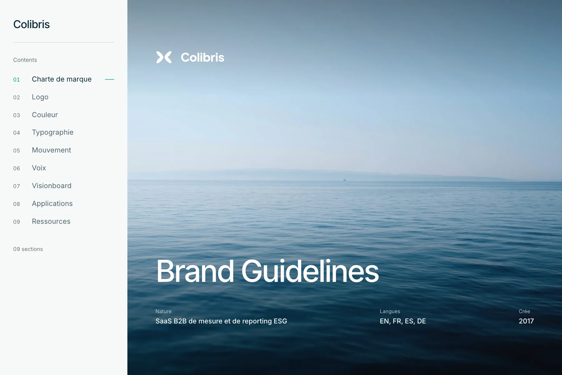
The Colibris brand guideline, published as a website

Colibris

Colibris is a B2B SaaS platform for measuring and publishing ESG performance, aimed at sustainability and finance teams.

The guideline is written in French and built on Inter alone. That plainness suits a brand whose whole promise is that every figure closes once a month and can be traced back to a single record.

Movement is used to show a figure settling into place, never to introduce a page.
Inter · 9 of 9 sections

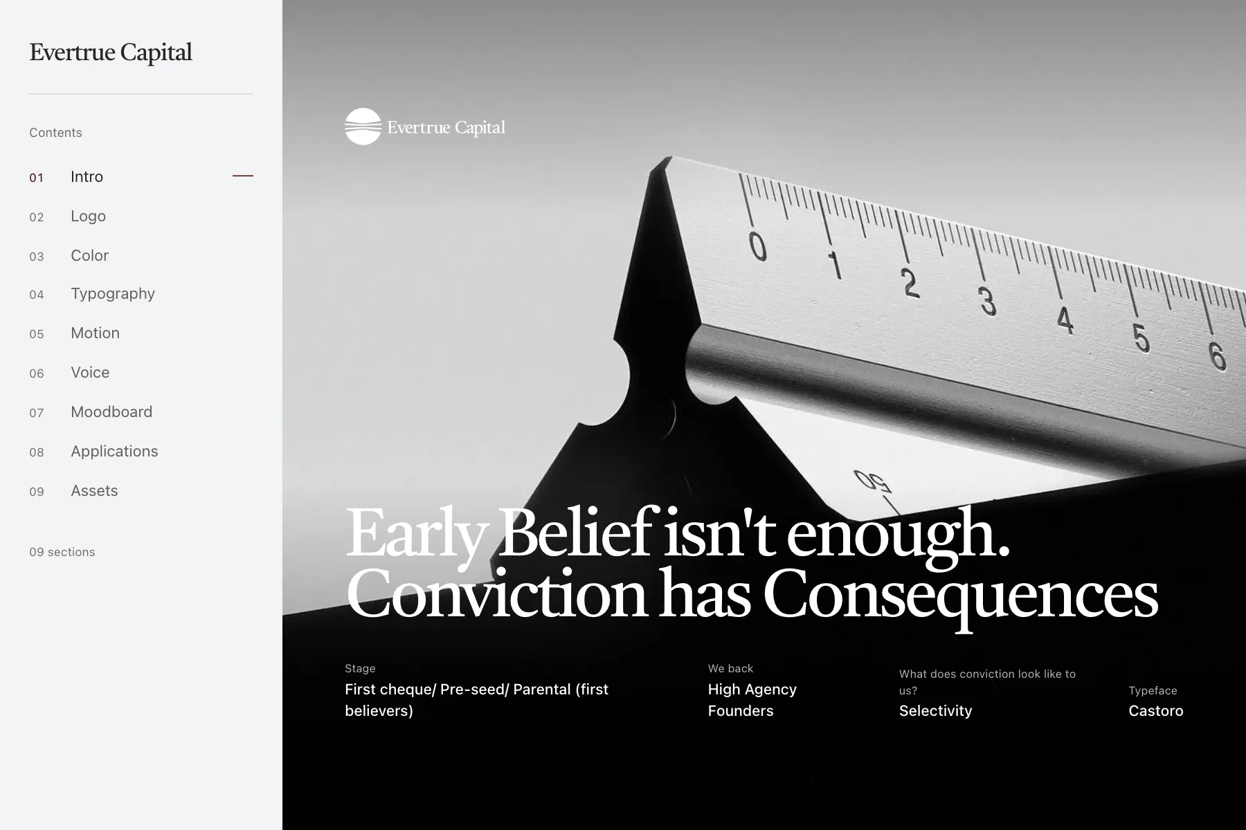
The Evertrue Capital brand guideline, published as a website

Evertrue Capital

Evertrue Capital opens on a quote about high-agency people leaning against a wall and discovering a hidden door.

Castoro for display against system-ui for text is a blunt pairing, and it works here because the writing carries the brand rather than the typography. Worth reading as an argument that a guideline can lead with prose.

Text arrives in long, unhurried lines, matching a brand that expects to be read.

Castoro and system-ui · 9 of 9 sections

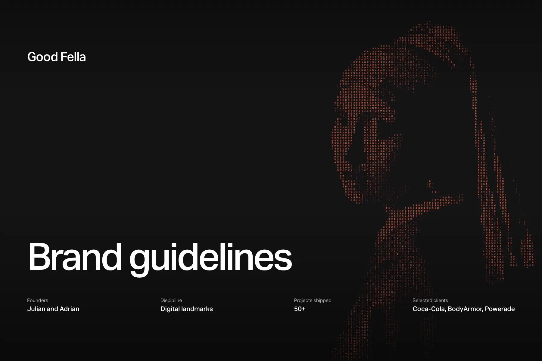
The Good Fella brand guideline, published as a website

Good Fella

Good Fella is a two-brother frontend studio in Vienna, and this is their own identity documented in their own tool.

Aktiv Grotesk does both jobs, display and text, with no second typeface anywhere in the system. That is a decision most brands are not confident enough to make, and it is the most interesting thing in the guideline.

Everything eases out and nothing bounces, in keeping with a studio that sells restraint.

Aktiv Grotesk · 9 of 9 sections

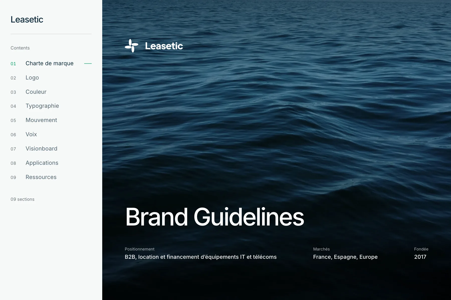
The Leasetic brand guideline, published as a website

Leasetic

Leasetic finances and manages IT and telecoms equipment for large companies across France, Spain and the rest of Europe.

The brand speaks in the first person plural and the guideline is unusually strict about it. Voice is documented as carefully as color here, which is rare and makes this the best entry in the gallery to read if you are writing a tone-of-voice section of your own.

Quiet, slow transitions that read as a bank rather than a startup.

Inter · 9 of 9 sections

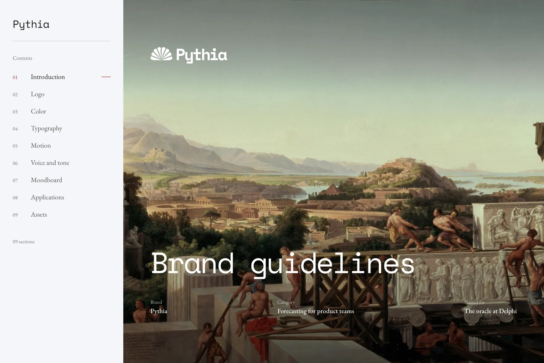
The Pythia brand guideline, published as a website

Pythia

Pythia is a forecasting platform that reads the numbers a product team already collects and states plainly where they are heading.

The type pairing is the part to look at: Space Mono for display against EB Garamond for text. A machine voice and a literary one in the same system, which sounds wrong written down and works on the page.

Numbers count up rather than fade in, so the motion is the product's argument rather than decoration.

Space Mono and EB Garamond · 9 of 9 sections

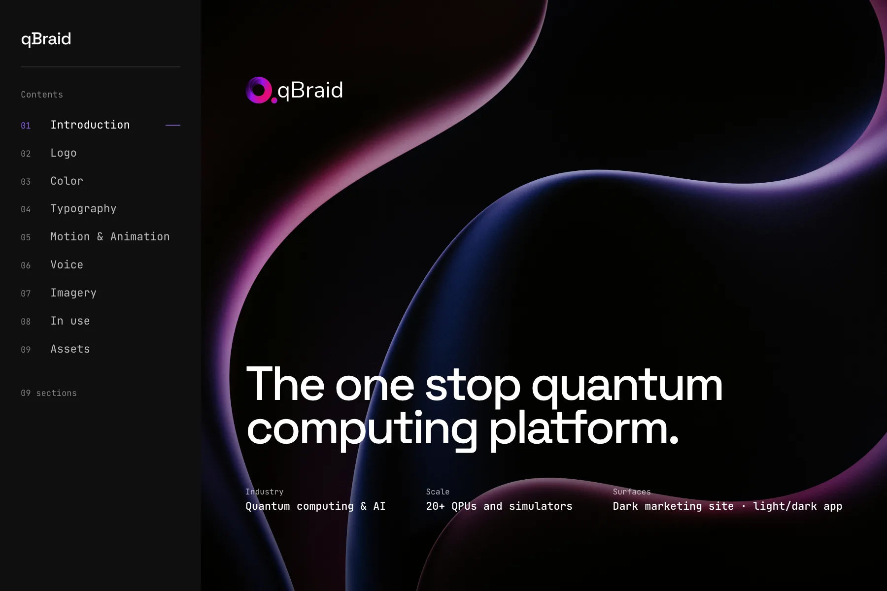
The qBraid brand guideline, published as a website

qBraid

qBraid is built for engineers shipping real quantum applications, and the brand is deliberately neutral so it stays out of the way of the work.

Space Grotesk and JetBrains Mono, technical without any of the usual sci-fi costume. The guideline spends most of its length on voice, which is unusual for a developer tool and probably correct for one.

Transitions are short and mechanical, closer to a terminal than to a marketing site.

Space Grotesk and JetBrains Mono · 9 of 9 sections

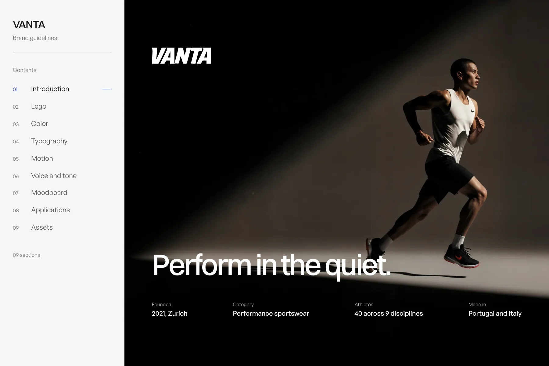
The VANTA brand guidelines brand guideline, published as a website

VANTA brand guidelines

VANTA makes performance sportswear for people who train alone at hours most people sleep through. The guideline carries that austerity into its own presentation: Switzer for display, General Sans for text, and very little else on the page.

All nine sections are documented, which makes it the most complete brand in the gallery and the one worth reading first if you want to see what a finished Vessa guideline looks like.

Type arrives fast and stops hard, which is the same restraint the label applies to its clothes.

Switzer and General Sans · 9 of 9 sections

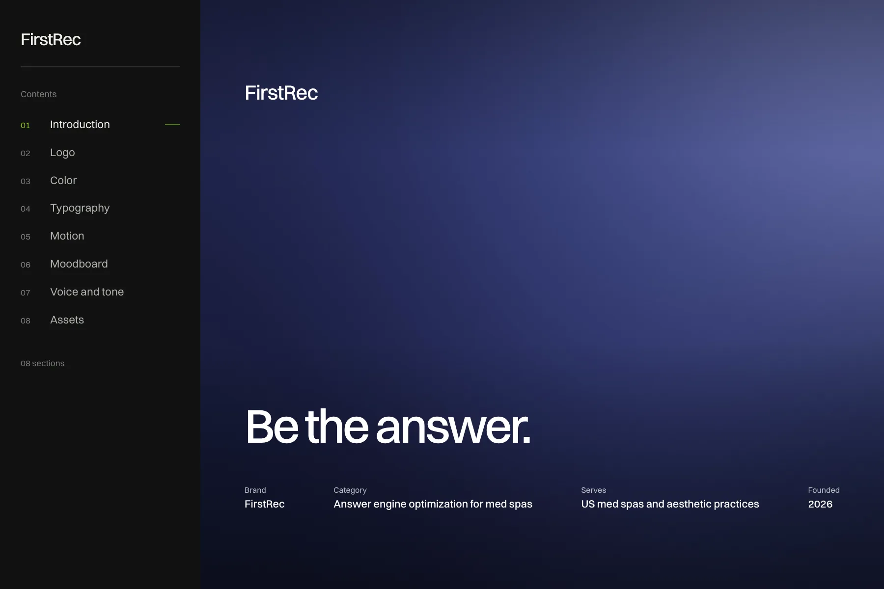
The FirstRec brand guideline, published as a website

FirstRec

FirstRec exists because people ask ChatGPT or Perplexity instead of scrolling ten links, and most spa owners have never checked what those answers say about them.

Switzer throughout, eight of the nine sections documented. The intro is the sharpest piece of positioning writing in the gallery, and it is worth the click for that alone.

Motion is used sparingly, mostly to move attention between two competing answers.

Switzer · 8 of 9 sections

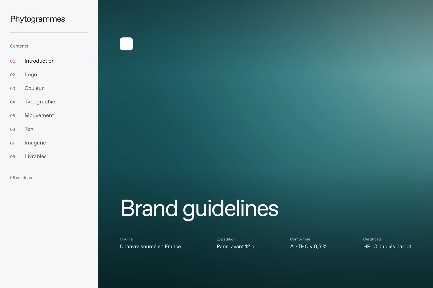
The Phytogrammes brand guideline, published as a website

Phytogrammes

Phytogrammes sells French CBD with radical transparency, down to the batch number, the certificate date and the exact Δ⁹-THC threshold on every product page.

ABC Favorit carries the entire system on its own. The guideline treats the certificate as the design object rather than something to hide in a footer, and the palette is built around making a lab number look intentional.

Reveals are used to bring a certificate figure forward, which is the brand's whole pitch in one gesture.

ABC Favorit · 8 of 9 sections

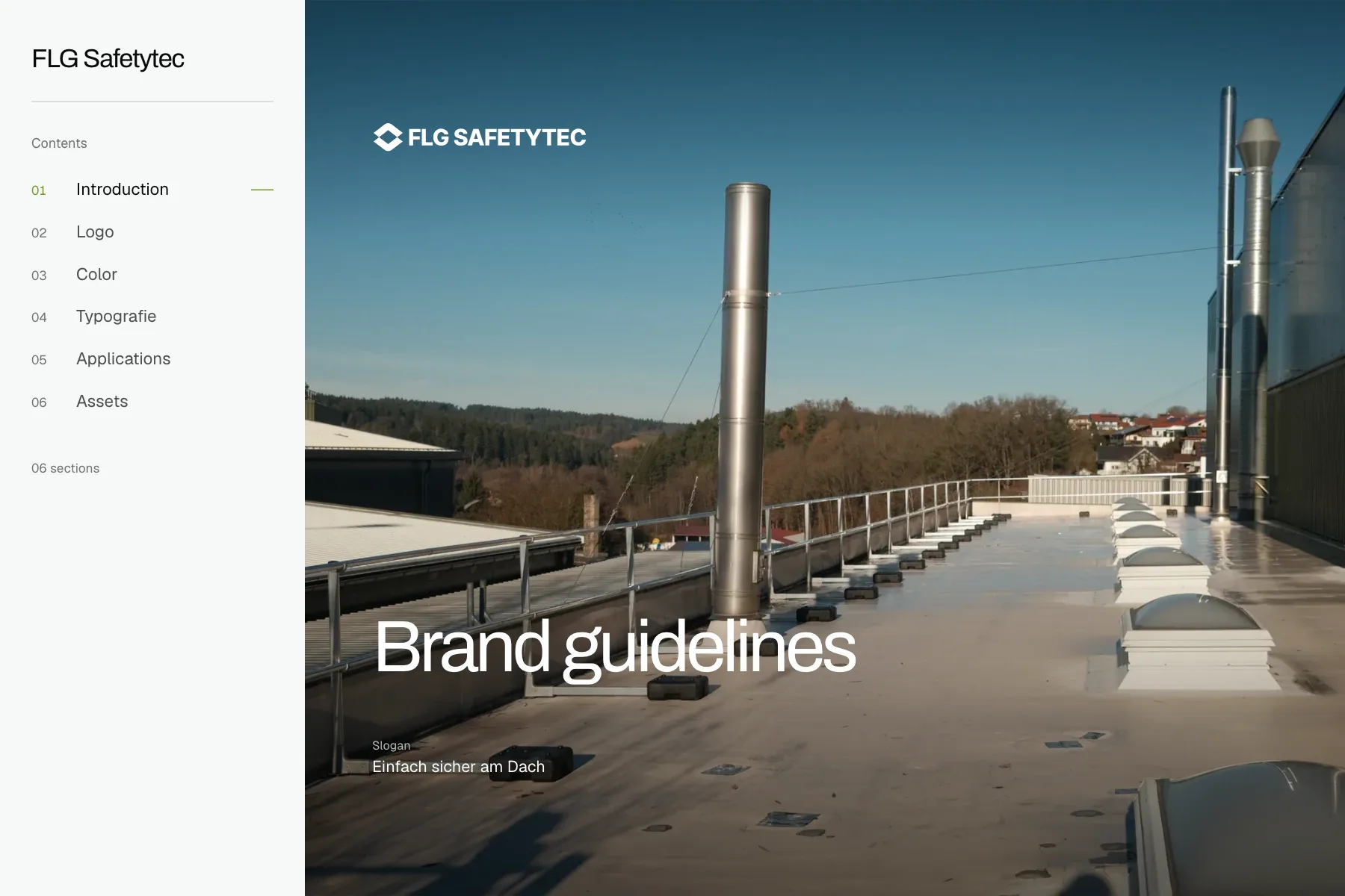
The FLG Safetytec brand guideline, published as a website

FLG Safetytec

FLG Safetytec does roof safety in Austria, and the guideline says what the company is for in four German words: einfach sicher am Dach.

Archivo and Geist, six sections, no motion and no moodboard. A small guideline, and a useful counterweight to the maximal ones above: it documents exactly what this brand needed and stops.

Archivo and Geist · 6 of 9 sections