Enter
Scaling in, opening. Content arriving into view.
Good Fella was founded by two brothers who grew up sharing a love for frontend development and the dream of building something of their own. What started as late-night projects turned into a craft, and eventually into a studio built on pride in the details.
We build digital landmarks, marketing sites that operate at flagship grade. Custom code, full motion, both brothers on every project. We ship fast but never sloppy, and we treat every product like our own name is on it, because it is.
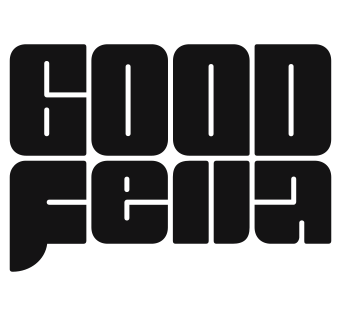
One mark, two inks. The fella runs in ink on light surfaces and in paper on dark ones, and it never changes shape.
Paper and ink do the work. Orange is the signal, and it stays scarce so it keeps meaning something.
Most surfaces stay paper and ink, and the brand color shows up where attention belongs. One accent per view.
On dark surfaces the orange steps up to #fd551d so it keeps its punch against near-black.
Aktiv Grotesk carries everything you read. Geist Mono stays small and uppercase, for labels and technical detail.
Aktiv Grotesk. Headlines run Medium, tracked tight. Light to Bold, with italics in the brand files.
Aktiv Grotesk Regular. Body copy from 14 to 20 px.
Great work
Great work
Aktiv Grotesk sets everything you read, from display headlines down to body copy. Geist Mono is the accent voice: it never sets a paragraph, it labels things, uppercase at 14 to 20 px with -2% tracking.
Four Aktiv weights plus their italics and both mono weights ship with the brand files.
Motion is why the studio exists. It earns its place by directing attention or rewarding an interaction, never as decoration.
In motion
Scaling in, opening. Content arriving into view.
Reordering, shuffling. The system responding to a gesture.
The view moves between fixed points. Near shapes sweep, far ones barely shift.
The view travels forward. What was far behind ends up in front of you.
One long sideways move. The curve decides how it starts and how it stops.
In real use
Carousel
Reveal
Accordion
Modal
The curve
Enter
Move
Restraint first. One or two precise moments per section beats a page that never sits still. Ease always. Entrances decelerate on expo and power4 curves, and linear easing is reserved for loops and scrubbed scroll. Stagger the children. Text lines and list items arrive 0.05 to 0.08 seconds apart, because everything landing on the same frame reads as mechanical.
Keep timing honest: 0.3 to 0.5 seconds for feedback, 0.6 to 0.9 for entrances. When unsure, it is too slow. Reduced motion is non-negotiable. Every animation resolves to a clean final state when motion is off.
We write like people. The studio speaks as we, warm and direct, and every sentence has to survive being read out loud.
We ship fast but never sloppy.
We've shipped 50+ projects for brands like Coca-Cola, BodyArmor and FIFA.
No corporate fluff, no disappearing acts, just work we fully stand behind.
We ship fast but never sloppy.
We deliver excellence with velocity.
Clear, human communication, honest timelines, and fair pricing with no surprise fees.
A seamless end-to-end client experience.
We've shipped 50+ frontend projects for brands like Coca-Cola and FIFA.
We work with leading brands.







Use the files as they are. The mark keeps its shape and its two inks, and the type stays at the weights shipped here.
The faces this brand sets in. Files or foundry links.
The palette as working files, generated from the tokens.